网站前端制作之css按钮动画效果
2023-03-09 分类: 网站建设
了解更多的按钮是很多网站页面的组成部分,为了使设计出来的页面更加美观,按钮的外观设计也重要,按钮需要实现的鼠标效应效果主要有默认和悬停状态,添加鼠标悬停,可以丰富优化按钮的设计,也可以吸引用户注意力,提升用户体验。鼠标的默认效果大多都是按照设计图上的效果实现,鼠标的悬停时按钮从默认效果到悬停状态的效果的转换效果,可以做到的效果有很多种,例如下面的三种效果:
Html:
了解更多
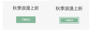
效果一是当鼠标悬停的时候,背景色从中间往左右两边扩散。
Css:
.combtn{
text-align: center;
}
.combtn a{
position: relative;
z-index: 1;
display: inline-block;
min-width: 150px;
height: 50px;
line-height: 48px;
border: #666666 solid 1px;
color: #323333;
font-size: 18px;
-webkit-transition: border-color 0.4s, color 0.4s;
transition: border-color 0.4s, color 0.4s;
}
.combtn a:hover{
color: #FFFFFF;
border: #85b79a solid 1px;
}
.combtn a::before {
content: '';
position: absolute;
top: 0;
left: 0;
width: 100%;
height: 100%;
background: #85b79a;
z-index: -1;
opacity: 0;
-webkit-transform: scale3d(0.7, 1, 1);
transform: scale3d(0.7, 1, 1);
-webkit-transition: -webkit-transform 0.4s, opacity 0.4s;
transition: transform 0.4s, opacity 0.4s;
-webkit-transition-timing-function: cubic-bezier(0.2, 1, 0.3, 1);
transition-timing-function: cubic-bezier(0.2, 1, 0.3, 1);
}
.combtn a:hover::before{
opacity: 1;
-webkit-transform: translate3d(0, 0, 0);
transform: translate3d(0, 0, 0);
}
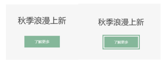
效果二是当鼠标悬停的时候,白色线框出现在按钮里面的四周。
了解更多按钮的样式效果如下图:
Css:
.combtn{
text-align: center;
}
.combtn a{
min-width: 150px;
height: 50px;
line-height: 50px;
color: #FFFFFF;
-webkit-transform: translateZ(0);
transform: translateZ(0);
box-shadow: 0 0 1px rgb(0 0 0 / 0%);
-webkit-backface-visibility: hidden;
backface-visibility: hidden;
-moz-osx-font-smoothing: grayscale;
position: relative;
background: #85b79a;
}
.combtn a:before {
content: '';
position: absolute;
border: white solid 4px;
top: 4px;
left: 4px;
right: 4px;
bottom: 4px;
opacity: 0;
-webkit-transition-duration: 0.3s;
transition-duration: 0.3s;
-webkit-transition-property: opacity;
transition-property: opacity;
}
.combtn a:hover:before, .combtn a:focus:before, .combtn a:active:before {
opacity: 1;
}
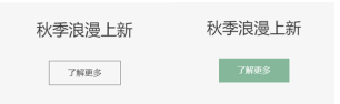
效果三是当鼠标悬停的时候,白色线框出现在按钮外面的四周。跟上面效果二的效果有些相似,效果二是白色线框在按钮里面,效果三是绿色线框在按钮在外面四周。
了解更多按钮的样式效果如下图:
Css:
.combtn{
text-align: center;
}
.combtn a{
min-width: 150px;
height: 50px;
line-height: 50px;
color: #FFFFFF;
-webkit-transform: translateZ(0);
transform: translateZ(0);
box-shadow: 0 0 1px rgb(0 0 0 / 0%);
-webkit-backface-visibility: hidden;
backface-visibility: hidden;
-moz-osx-font-smoothing: grayscale;
position: relative;
background: #85b79a;
-webkit-transform: translateZ(0);
transform: translateZ(0);
box-shadow: 0 0 1px rgb(0 0 0 / 0%);
-webkit-backface-visibility: hidden;
backface-visibility: hidden;
-moz-osx-font-smoothing: grayscale;
}
.combtn a:before {
content: '';
position: absolute;
border: #85b79a solid 4px;
top: 0;
right: 0;
bottom: 0;
left: 0;
-webkit-transition-duration: 0.3s;
transition-duration: 0.3s;
-webkit-transition-property: top, right, bottom, left;
transition-property: top, right, bottom, left;
}
.combtn a:hover:before, .combtn a:focus:before, .combtn a:active:before {
top: -8px;
right: -8px;
bottom: -8px;
Html:
了解更多
效果一是当鼠标悬停的时候,背景色从中间往左右两边扩散。
Css:
.combtn{
text-align: center;
}
.combtn a{
position: relative;
z-index: 1;
display: inline-block;
min-width: 150px;
height: 50px;
line-height: 48px;
border: #666666 solid 1px;
color: #323333;
font-size: 18px;
-webkit-transition: border-color 0.4s, color 0.4s;
transition: border-color 0.4s, color 0.4s;
}
.combtn a:hover{
color: #FFFFFF;
border: #85b79a solid 1px;
}
.combtn a::before {
content: '';
position: absolute;
top: 0;
left: 0;
width: 100%;
height: 100%;
background: #85b79a;
z-index: -1;
opacity: 0;
-webkit-transform: scale3d(0.7, 1, 1);
transform: scale3d(0.7, 1, 1);
-webkit-transition: -webkit-transform 0.4s, opacity 0.4s;
transition: transform 0.4s, opacity 0.4s;
-webkit-transition-timing-function: cubic-bezier(0.2, 1, 0.3, 1);
transition-timing-function: cubic-bezier(0.2, 1, 0.3, 1);
}
.combtn a:hover::before{
opacity: 1;
-webkit-transform: translate3d(0, 0, 0);
transform: translate3d(0, 0, 0);
}
效果二是当鼠标悬停的时候,白色线框出现在按钮里面的四周。
了解更多按钮的样式效果如下图:
Css:
.combtn{
text-align: center;
}
.combtn a{
min-width: 150px;
height: 50px;
line-height: 50px;
color: #FFFFFF;
-webkit-transform: translateZ(0);
transform: translateZ(0);
box-shadow: 0 0 1px rgb(0 0 0 / 0%);
-webkit-backface-visibility: hidden;
backface-visibility: hidden;
-moz-osx-font-smoothing: grayscale;
position: relative;
background: #85b79a;
}
.combtn a:before {
content: '';
position: absolute;
border: white solid 4px;
top: 4px;
left: 4px;
right: 4px;
bottom: 4px;
opacity: 0;
-webkit-transition-duration: 0.3s;
transition-duration: 0.3s;
-webkit-transition-property: opacity;
transition-property: opacity;
}
.combtn a:hover:before, .combtn a:focus:before, .combtn a:active:before {
opacity: 1;
}
效果三是当鼠标悬停的时候,白色线框出现在按钮外面的四周。跟上面效果二的效果有些相似,效果二是白色线框在按钮里面,效果三是绿色线框在按钮在外面四周。
了解更多按钮的样式效果如下图:
Css:
.combtn{
text-align: center;
}
.combtn a{
min-width: 150px;
height: 50px;
line-height: 50px;
color: #FFFFFF;
-webkit-transform: translateZ(0);
transform: translateZ(0);
box-shadow: 0 0 1px rgb(0 0 0 / 0%);
-webkit-backface-visibility: hidden;
backface-visibility: hidden;
-moz-osx-font-smoothing: grayscale;
position: relative;
background: #85b79a;
-webkit-transform: translateZ(0);
transform: translateZ(0);
box-shadow: 0 0 1px rgb(0 0 0 / 0%);
-webkit-backface-visibility: hidden;
backface-visibility: hidden;
-moz-osx-font-smoothing: grayscale;
}
.combtn a:before {
content: '';
position: absolute;
border: #85b79a solid 4px;
top: 0;
right: 0;
bottom: 0;
left: 0;
-webkit-transition-duration: 0.3s;
transition-duration: 0.3s;
-webkit-transition-property: top, right, bottom, left;
transition-property: top, right, bottom, left;
}
.combtn a:hover:before, .combtn a:focus:before, .combtn a:active:before {
top: -8px;
right: -8px;
bottom: -8px;
left: -8px;
本文题目:网站前端制作之css按钮动画效果
当前URL:https://www.cdcxhl.com/news33/242733.html
成都网站建设公司_创新互联,为您提供服务器托管、建站公司、微信小程序、网站排名、动态网站、外贸建站
声明:本网站发布的内容(图片、视频和文字)以用户投稿、用户转载内容为主,如果涉及侵权请尽快告知,我们将会在第一时间删除。文章观点不代表本网站立场,如需处理请联系客服。电话:028-86922220;邮箱:631063699@qq.com。内容未经允许不得转载,或转载时需注明来源: 创新互联
猜你还喜欢下面的内容
- 新站长怎样推广网站!--基础实效篇 2023-03-09
- 搜索引擎禁止的行为有哪些? 2023-03-09
- 成都CSS制作网页时遇到问题的参考技巧 2023-03-09
- 互动网站是怎样的以及如何建设 2023-03-09
- 如何制作一个具有品牌特色的高端网站 2023-03-09
- 网站开发公司怎么选?要从哪些方面考虑? 2023-03-09
- 海西seo:网站页面先收录,然后又消失? 2023-03-09
- 汲取设计的灵魂,六个优秀创意网站欣赏 2023-03-09
- 文章关键词是否每一处都要加粗 2023-03-09

- 成都轻松搞定IE的CSS制作网页技巧3则 2023-03-09
- 国内三四线城市建站行业观察 2023-03-09
- 网站与搜索引擎:从蜜月到婚姻到分居 2023-03-09
- 成都做个网站卖点广告就算创业了? 2023-03-09
- 搜索引擎营销(SEM)常用方法 2023-03-09
- 如何设置产品参数和文章参数? 2023-03-09
- 大势所趋网页设计挂起一阵扁平风 2023-03-09
- 石家庄网站建设公司_辛集企业网站建设_网站制作公司 2023-03-09
- 成都建站选择哪家公司好呢 2023-03-09
- 网站开发其实就是“讲故事”要精巧的设计和构思 2023-03-09