如何编写自适应网页
2023-02-10 分类: 网站建设
现在的上线网站,自适应网站占有了一定比例。作为一个菜鸟前端,这段时间编写了一个静态的自适应网页。对此,写下这篇文章。文章主要讲一些自适应网页基本原理和总结一些项目中遇见的问题。一,自适应网页基本原理我是由2个问题出发的:
问题1:自适应网页由什么构成?
简单来说,自适应网页和pc网页,移动端网页是一样,都是由js、css、html构成。
问题2:如何让网页自适应?
我所理解的自适应网页就是这个网页可以兼容所有的屏幕,在用户的屏幕上排版流利、顺畅。正常显示。不会给用户一种别扭的感觉。
那么为了能够让网页兼容各大页面。你可以使用css的media。
下面我列举一下最基本的主流屏幕,在css里面应该怎么写。这是兼容4k屏幕到手机端的写法。你必须要知道的点:1.
这是从2560px 到 手机端 的写法;2.
media的像素大小必须由大到小排列:3.
首先,编写常规的格式,即清除一些css的默认样式;再来,编写2560px时,样式的变化;接着,往小屏幕编写代码。最后,测试即可。二,总结此次项目遇见的问题此次项目主要遇见2个问题:
问题1:测试时,用户发现在自己的华为pus10上没办法正常显示。
解决方法:经过一系列的百度和搜狗。最后发现华为pu10它的分辨率比正常手机大很多,像素为1920*1080,因此要在编写1920px的media之前,写下一些代码:
/*针对华为手机图标无法正常比例缩放问题*/
@media screen and (max-device-width: 2100px) {
这是你要编写的代码
}
Ps:因为作者了解到,现在市场上流通常见的手机屏幕大高达2100px,所以,上面的写法可以很好的兼容(2100到最小手机端)。
问题2:关于项目中轮播图的问题。
这个解决方法有点长,先省略。
三,分享一个干货(自适应样式的基本写法)@charset "UTF-8";
/*整站样式*/
*,:after,:before {margin: 0;padding: 0;-webkit-box-sizing: border-box;-moz-box-sizing: border-box;box-sizing: border-box;outline: 0!important;-webkit-tap-highlight-color: rgba(255, 255, 255, 0);-webkit-tap-highlight-color: transparent;-webkit-text-size-adjust: 100%;-webkit-font-smoothing: antialiased;font-smoothing: antialiased}
body {color: #333;font-size: 14px;line-height: 1.5;font-family: 'Microsoft Yahei', "PingFang SC", "Helvetica Neue", Helvetica, Arial, sans-serif;-webkit-font-smoothing: antialiased;margin: 0px;}
img {max-width: 100%;border: none}
input,select,textarea {font-size: 14px;color: #333;font-family: 'Microsoft Yahei', "PingFang SC", "Helvetica Neue", Helvetica, Arial, sans-serif;border: none}
input[type=submit],input[type=button],input[type=checkbox],input[type=radio],input[type=reset],select {-webkit-appearance: none;-moz-appearance: none;appearance: none}
::-webkit-input-placeholder {color: #999}
::-moz-placeholder {color: #999}
::-ms-input-placeholder {color: #999}
select::-ms-expand {display: none}
/*定义滚动条*/
.scrollbar::-webkit-scrollbar {width: 5px;height: 10px;background-color: transparent;}
.scrollbar::-webkit-scrollbar-track {-webkit-box-shadow: inset 0 0 6px rgba(0, 0, 0, 0);border-radius: 5px;background-color: transparent;}
.scrollbar::-webkit-scrollbar-thumb {background-color: #CCCCCC;width: 5px;}
a {cursor: pointer;color: #333;text-decoration: none}
ul {list-style: none}
.fix {*zoom: 1}
.fix:after,.fix:before {display: block;content: "";height: 0;clear: both}
table {border-collapse: collapse;border-spacing: 0}
.c {clear: both}
em {font-style: normal}
.clearfix:before,.clearfix:after {content: "";display: table;}
.clearfix:after {clear: both;}
.clearfix {zoom: 1;}
.wrap {width: 98%;margin: 0px auto;}
.ones {overflow: hidden;text-overflow: ellipsis;white-space: nowrap;}
.twos {overflow: hidden;text-overflow: ellipsis;display: -webkit-box;-webkit-line-clamp: 2;-webkit-box-orient: vertical;}
/*基本显示屏幕(请编写自定义代码)*/
请在里面编写代码;
/*针对华为手机图标无法正常比例缩放问题*/
@media screen and (max-device-width: 2100px) {
请在里面编写代码;
}
/*基本编写顺序*/
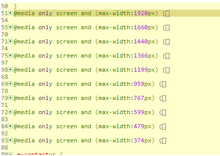
@media only screen and (max-width:1920px) {
请在里面编写代码;
}
@media only screen and (max-width:1660px) {
请在里面编写代码;
}
@media only screen and (max-width:1440px) {
请在里面编写代码;
}
@media only screen and (max-width:1366px) {
请在里面编写代码;
}
@media only screen and (max-width:1199px) {
请在里面编写代码;
}
@media only screen and (max-width:959px) {
请在里面编写代码;
}
@media only screen and (max-width:767px) {
请在里面编写代码;
}
@media only screen and (max-width:599px) {
请在里面编写代码;
}
@media only screen and (max-width:479px) {
请在里面编写代码;
}
@media only screen and (max-width:374px) {
请在里面编写代码;
}
作者:创新互联前端工程师冯秋宁
创新互联专注于移动端网站开发,响应式网站建设、自适应网站建设,欢迎有需要的客户咨询我们客服热线400-028-6601
问题1:自适应网页由什么构成?
简单来说,自适应网页和pc网页,移动端网页是一样,都是由js、css、html构成。
问题2:如何让网页自适应?
我所理解的自适应网页就是这个网页可以兼容所有的屏幕,在用户的屏幕上排版流利、顺畅。正常显示。不会给用户一种别扭的感觉。
那么为了能够让网页兼容各大页面。你可以使用css的media。
下面我列举一下最基本的主流屏幕,在css里面应该怎么写。这是兼容4k屏幕到手机端的写法。你必须要知道的点:1.
这是从2560px 到 手机端 的写法;2.
media的像素大小必须由大到小排列:3.
首先,编写常规的格式,即清除一些css的默认样式;再来,编写2560px时,样式的变化;接着,往小屏幕编写代码。最后,测试即可。二,总结此次项目遇见的问题此次项目主要遇见2个问题:
问题1:测试时,用户发现在自己的华为pus10上没办法正常显示。
解决方法:经过一系列的百度和搜狗。最后发现华为pu10它的分辨率比正常手机大很多,像素为1920*1080,因此要在编写1920px的media之前,写下一些代码:
/*针对华为手机图标无法正常比例缩放问题*/
@media screen and (max-device-width: 2100px) {
这是你要编写的代码
}
Ps:因为作者了解到,现在市场上流通常见的手机屏幕大高达2100px,所以,上面的写法可以很好的兼容(2100到最小手机端)。
问题2:关于项目中轮播图的问题。
这个解决方法有点长,先省略。
三,分享一个干货(自适应样式的基本写法)@charset "UTF-8";
/*整站样式*/
*,:after,:before {margin: 0;padding: 0;-webkit-box-sizing: border-box;-moz-box-sizing: border-box;box-sizing: border-box;outline: 0!important;-webkit-tap-highlight-color: rgba(255, 255, 255, 0);-webkit-tap-highlight-color: transparent;-webkit-text-size-adjust: 100%;-webkit-font-smoothing: antialiased;font-smoothing: antialiased}
body {color: #333;font-size: 14px;line-height: 1.5;font-family: 'Microsoft Yahei', "PingFang SC", "Helvetica Neue", Helvetica, Arial, sans-serif;-webkit-font-smoothing: antialiased;margin: 0px;}
img {max-width: 100%;border: none}
input,select,textarea {font-size: 14px;color: #333;font-family: 'Microsoft Yahei', "PingFang SC", "Helvetica Neue", Helvetica, Arial, sans-serif;border: none}
input[type=submit],input[type=button],input[type=checkbox],input[type=radio],input[type=reset],select {-webkit-appearance: none;-moz-appearance: none;appearance: none}
::-webkit-input-placeholder {color: #999}
::-moz-placeholder {color: #999}
::-ms-input-placeholder {color: #999}
select::-ms-expand {display: none}
/*定义滚动条*/
.scrollbar::-webkit-scrollbar {width: 5px;height: 10px;background-color: transparent;}
.scrollbar::-webkit-scrollbar-track {-webkit-box-shadow: inset 0 0 6px rgba(0, 0, 0, 0);border-radius: 5px;background-color: transparent;}
.scrollbar::-webkit-scrollbar-thumb {background-color: #CCCCCC;width: 5px;}
a {cursor: pointer;color: #333;text-decoration: none}
ul {list-style: none}
.fix {*zoom: 1}
.fix:after,.fix:before {display: block;content: "";height: 0;clear: both}
table {border-collapse: collapse;border-spacing: 0}
.c {clear: both}
em {font-style: normal}
.clearfix:before,.clearfix:after {content: "";display: table;}
.clearfix:after {clear: both;}
.clearfix {zoom: 1;}
.wrap {width: 98%;margin: 0px auto;}
.ones {overflow: hidden;text-overflow: ellipsis;white-space: nowrap;}
.twos {overflow: hidden;text-overflow: ellipsis;display: -webkit-box;-webkit-line-clamp: 2;-webkit-box-orient: vertical;}
/*基本显示屏幕(请编写自定义代码)*/
请在里面编写代码;
/*针对华为手机图标无法正常比例缩放问题*/
@media screen and (max-device-width: 2100px) {
请在里面编写代码;
}
/*基本编写顺序*/
@media only screen and (max-width:1920px) {
请在里面编写代码;
}
@media only screen and (max-width:1660px) {
请在里面编写代码;
}
@media only screen and (max-width:1440px) {
请在里面编写代码;
}
@media only screen and (max-width:1366px) {
请在里面编写代码;
}
@media only screen and (max-width:1199px) {
请在里面编写代码;
}
@media only screen and (max-width:959px) {
请在里面编写代码;
}
@media only screen and (max-width:767px) {
请在里面编写代码;
}
@media only screen and (max-width:599px) {
请在里面编写代码;
}
@media only screen and (max-width:479px) {
请在里面编写代码;
}
@media only screen and (max-width:374px) {
请在里面编写代码;
}
作者:创新互联前端工程师冯秋宁
创新互联专注于移动端网站开发,响应式网站建设、自适应网站建设,欢迎有需要的客户咨询我们客服热线400-028-6601
文章名称:如何编写自适应网页
标题URL:https://www.cdcxhl.com/news/236411.html
成都网站建设公司_创新互联,为您提供网站设计、外贸网站建设、关键词优化、营销型网站建设、静态网站、网站排名
声明:本网站发布的内容(图片、视频和文字)以用户投稿、用户转载内容为主,如果涉及侵权请尽快告知,我们将会在第一时间删除。文章观点不代表本网站立场,如需处理请联系客服。电话:028-86922220;邮箱:631063699@qq.com。内容未经允许不得转载,或转载时需注明来源: 创新互联
猜你还喜欢下面的内容
- 单页网站的优点以及建站要点 2023-02-10
- 成都如何将成都网站建设中的广告处理好 2023-02-10
- 网站建设对于企业的发展有哪些帮助 2023-02-10
- 免费的seo培训怎么样 2023-02-10
- 郴州网站建设,网站制作,做网站推广优化设计 2023-02-10
- 网站推广优化排名,网站推广seo优化的好处 2023-02-10
- 如何做好网站维护工作 2023-02-10

- 遵义seo网站优化中如何快速获得高质量外链? 2023-02-10
- 企业官网设计中的用户隐私问题探讨 2023-02-10
- 交互式网站的建设中常常会出现哪些错误 2023-02-10
- 微信小程序WXS脚本语言有什么用 2023-02-10
- 网络营销的优势到底有哪些? 2023-02-10
- 创新互联谈解决网站程序问题的方法 2023-02-10
- 成都网站建设完成后如何做才算真正的网站竣工? 2023-02-10
- 成都web服务结构的设计 2023-02-10
- 企业建站前的需要注意哪些呢? 2023-02-10
- 锦州网站建设|锦州网站制作|锦州网站SEO优化 2023-02-10
- 网站策划到战略与执行的问题 2023-02-10
- 如何判断成都网站开发公司的专业性 2023-02-10