前端制作中鼠标经过按钮的效果总结
2023-02-06 分类: 网站建设
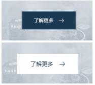
页面布局中的模块内容有不少是带有按钮的,譬如是了解更多的按钮、表单提交的按钮等。按钮有引导用户点击、激发用户点击行为等的作用,例如下单购买商品或者跳转链接或者展开更多内容以达到了解更多的详情的目的。与页面风格协调的按钮设计可以增加页面的美观效果和更易于吸引客户的注意力,为了提高用户对关于页面操作的体验度,还可以在按钮的制作中加入一些动态效果。例如,当鼠标经过按钮的时候,可以适当添加一些动态效果或者加入背景的填充,下面是可以在日常工作中需要用css3制作鼠标经过页面按钮能用到的动画效果。
Html:
CSS:
.i-title .btn{
text-align: center;
margin-top: 50px;
}
.i-title .btn a{
background: none;
border: none;
display: inline-block;
text-align: center;
font-size: 14px;
color: #FFFFFF;
position: relative;
padding: 17px 35px;
overflow: hidden;
font-weight: 400;
cursor: pointer;
-moz-transition: all 400ms ease-in-out;
-o-transition: all 400ms ease-in-out;
-webkit-transition: all 400ms ease-in-out;
transition: all 400ms ease-in-out;
}
.i-title .btn a:before{
content: "";
position: absolute;
z-index: 50;
-moz-transition: all 1.4s ease;
-o-transition: all 1.4s ease;
-webkit-transition: all 1.4s ease;
transition: all 1.4s ease;
top: 0;
left: 0;
width: 100%;
height: 100%;
background-color: rgba(27,57,82,0.3);
-moz-transform: scale(1.02, 1.02);
-ms-transform: scale(1.02, 1.02);
-webkit-transform: scale(1.02, 1.02);
transform: scale(1.02, 1.02);
-moz-transition: all 400ms ease-in-out;
-o-transition: all 400ms ease-in-out;
-webkit-transition: all 400ms ease-in-out;
transition: all 400ms ease-in-out;
}
.i-title .btn a:after{
content: "";
display: block;
position: absolute;
top: 2px;
left: 2px;
right: 2px;
bottom: 2px;
background-color: #1b3952;
z-index: 100;
-moz-transition: all 400ms ease-in-out;
-o-transition: all 400ms ease-in-out;
-webkit-transition: all 400ms ease-in-out;
transition: all 400ms ease-in-out;
}
.i-title .btn a span{
position: relative;
z-index: 300;
-moz-transition: all 400ms ease-in-out;
-o-transition: all 400ms ease-in-out;
-webkit-transition: all 400ms ease-in-out;
transition: all 400ms ease-in-out;
padding-right: 30px;
background: url(../images/img16.png) center right no-repeat;
}
.i-title .btn a:hover span{
background: url(../images/img17.png) center right no-repeat;
-moz-transition: all 400ms ease-in-out;
-o-transition: all 400ms ease-in-out;
-webkit-transition: all 400ms ease-in-out;
transition: all 400ms ease-in-out;
}
Html:
Css:
.xbtn a{
position: relative;
display: block;
margin: 20px auto;
text-align: center;
width: 150px;
height: 50px;
line-height: 50px;
max-width: 250px;
color: #FFFFFF;
text-transform: uppercase;
overflow: hidden;
border: 1px solid currentColor;
}
.xbtn a:hover{
color: #1b3952;
}
.xbtn a span{
position: absolute;
display: block;
width: 0;
height: 0;
border-radius: 50%;
background: #FFFFFF;
-webkit-transform: translate(-50%, -50%);
transform: translate(-50%, -50%);
-webkit-transition: width 0.4s, height 0.4s;
transition: width 0.4s, height 0.4s;
z-index: -1;
}
.xbtn a:hover span {
width: 320px;
Html:
CSS:
.i-title .btn{
text-align: center;
margin-top: 50px;
}
.i-title .btn a{
background: none;
border: none;
display: inline-block;
text-align: center;
font-size: 14px;
color: #FFFFFF;
position: relative;
padding: 17px 35px;
overflow: hidden;
font-weight: 400;
cursor: pointer;
-moz-transition: all 400ms ease-in-out;
-o-transition: all 400ms ease-in-out;
-webkit-transition: all 400ms ease-in-out;
transition: all 400ms ease-in-out;
}
.i-title .btn a:before{
content: "";
position: absolute;
z-index: 50;
-moz-transition: all 1.4s ease;
-o-transition: all 1.4s ease;
-webkit-transition: all 1.4s ease;
transition: all 1.4s ease;
top: 0;
left: 0;
width: 100%;
height: 100%;
background-color: rgba(27,57,82,0.3);
-moz-transform: scale(1.02, 1.02);
-ms-transform: scale(1.02, 1.02);
-webkit-transform: scale(1.02, 1.02);
transform: scale(1.02, 1.02);
-moz-transition: all 400ms ease-in-out;
-o-transition: all 400ms ease-in-out;
-webkit-transition: all 400ms ease-in-out;
transition: all 400ms ease-in-out;
}
.i-title .btn a:after{
content: "";
display: block;
position: absolute;
top: 2px;
left: 2px;
right: 2px;
bottom: 2px;
background-color: #1b3952;
z-index: 100;
-moz-transition: all 400ms ease-in-out;
-o-transition: all 400ms ease-in-out;
-webkit-transition: all 400ms ease-in-out;
transition: all 400ms ease-in-out;
}
.i-title .btn a span{
position: relative;
z-index: 300;
-moz-transition: all 400ms ease-in-out;
-o-transition: all 400ms ease-in-out;
-webkit-transition: all 400ms ease-in-out;
transition: all 400ms ease-in-out;
padding-right: 30px;
background: url(../images/img16.png) center right no-repeat;
}
.i-title .btn a:hover span{
background: url(../images/img17.png) center right no-repeat;
-moz-transition: all 400ms ease-in-out;
-o-transition: all 400ms ease-in-out;
-webkit-transition: all 400ms ease-in-out;
transition: all 400ms ease-in-out;
}

Html:
Css:
.xbtn a{
position: relative;
display: block;
margin: 20px auto;
text-align: center;
width: 150px;
height: 50px;
line-height: 50px;
max-width: 250px;
color: #FFFFFF;
text-transform: uppercase;
overflow: hidden;
border: 1px solid currentColor;
}
.xbtn a:hover{
color: #1b3952;
}
.xbtn a span{
position: absolute;
display: block;
width: 0;
height: 0;
border-radius: 50%;
background: #FFFFFF;
-webkit-transform: translate(-50%, -50%);
transform: translate(-50%, -50%);
-webkit-transition: width 0.4s, height 0.4s;
transition: width 0.4s, height 0.4s;
z-index: -1;
}
.xbtn a:hover span {
width: 320px;
height: 320px;
当前题目:前端制作中鼠标经过按钮的效果总结
分享地址:https://www.cdcxhl.com/news/235571.html
成都网站建设公司_创新互联,为您提供网站导航、品牌网站制作、网站制作、用户体验、网站设计、移动网站建设
声明:本网站发布的内容(图片、视频和文字)以用户投稿、用户转载内容为主,如果涉及侵权请尽快告知,我们将会在第一时间删除。文章观点不代表本网站立场,如需处理请联系客服。电话:028-86922220;邮箱:631063699@qq.com。内容未经允许不得转载,或转载时需注明来源: 创新互联
猜你还喜欢下面的内容
- 成都内容营销的定义一起作用是什么 2023-02-06
- 成都网站建设与你分享企业网站如何才能发挥应有的价值 2023-02-06
- 成都网站建立对一个公司有多重要 2023-02-06
- 方案分享:完整的企业网站策划流程 2023-02-06
- 成都网站建设与你分享企业网站建设—CSS样式 2023-02-06
- 成都你未必知道的10个CSS技巧 2023-02-06
- 网站建设对企业的影响有多大? 2023-02-06
- 怎么查询网站的锚文本外链 2023-02-06
- 公司网站建设流程概括 2023-02-06
- 成都社区O2O切入点很重要! 2023-02-06
- 网站制作如何与质量对齐 2023-02-06
- 实用的app营销策略有哪些 2023-02-06
- 网站设计的主观与客观困扰 2023-02-06
- 快速提高文章收录:百度自动推送文章收录怎么做? 2023-02-06
- 微信开发哪些方面非常适合旅游行业呢? 2023-02-06
- 小程序能够给餐饮带来哪些价值? 2023-02-06
- 自传播网站的“不靠谱”和“可实现” 2023-02-06
- 东莞百度推广能给传统行业带来什么呢? 2023-02-06
- 企业如何利用网络做好网站推广? 2023-02-06