css3如何实现wifi信号逐渐增强效果-创新互联
小编给大家分享一下css3如何实现wifi信号逐渐增强效果,希望大家阅读完这篇文章之后都有所收获,下面让我们一起去探讨吧!

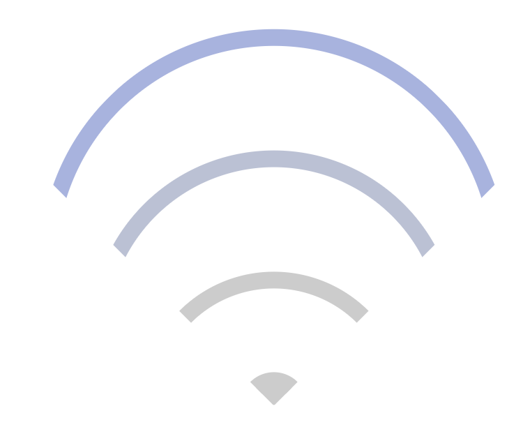
效果图
下面是实现代码:
<!DOCTYPE html>
<meta charset="utf-8">
<html>
<head>
    <title>wifi信号</title>
    <style type="text/css">
        *{
            margin: 0;
            padding: 0;
        }
        .box {
            width: 240px;
            height: 240px;
            box-sizing: border-box;
            position: relative;
            margin: 100px auto;
        }
        .wifi-symbol {
            width: 200px;
            height: 200px;
            margin-left: 18px;
            box-sizing: border-box;
            overflow: hidden;
            transform: rotate(45deg);

        }
        .wifi-circle {
            border: 10px solid #ccc;
            border-radius: 50%;
            position: absolute;
        }
        .first {
            width: 260px;
            height: 260px;
            top: 0;
            left: 0;
            animation: run1 4s linear infinite;
        }
        @keyframes run1 {
            0% {
                border-color: #ccc;
            }
            25% {
                border-color: #ccc;
            }
            50% {
                border-color: #ccc;
            }
            75% {
                border-color: #ccc;
            }
            100% {
                border-color: #97a8e6;
            }
        }
        .second {
            width: 200px;
            height: 200px;
            top: 60px;
            left: 60px;
            animation: run2 4s linear infinite;
        }
        @keyframes run2 {
            0% {
                border-color: #ccc;
            }
            25% {
                border-color: #ccc;
            }
            50% {
                border-color: #ccc;
            }
            75% {
                border-color: #97a8e6;
            }
            100% {
                border-color: #ccc;
            }
        }
        .third {
            width: 140px;
            height: 140px;
            top: 120px;
            left: 120px;
            animation: run3 4s linear infinite;
        }
        @keyframes run3 {
            0% {
                border-color: #ccc;
            }
            25% {
                border-color: #ccc;
            }
            50% {
                border-color: #97a8e6;
            }
            75% {
                border-color: #ccc;
            }
            100% {
                border-color: #ccc;
            }
        }
        .fourth {
            width: 20px;
            height: 20px;
            background: #ccc;
            top: 180px;
            left: 180px;
            animation: run4 4s linear infinite;
        }
        @keyframes run4 {
            0% {
                background: #ccc;
                border-color: #ccc;
            }
            25% {
                background: #97a8e6;
                border-color: #97a8e6;
            }
            50% {
                background: #ccc;
                border-color: #ccc;
            }
            75% {
                background: #ccc;
                border-color: #ccc;
            }
            100% {
                background: #ccc;
                border-color: #ccc;
            }
        }
    </style>
</head>
<body>
    <div class="box">
        <div class="wifi-symbol">
          <div class="wifi-circle first"></div>
          <div class="wifi-circle second"></div>
          <div class="wifi-circle third"></div>
          <div class="wifi-circle fourth">
        </div>
    </div>

</body>
</html>
看完了这篇文章,相信你对“css3如何实现wifi信号逐渐增强效果”有了一定的了解,如果想了解更多相关知识,欢迎关注创新互联行业资讯频道,感谢各位的阅读!
新闻标题:css3如何实现wifi信号逐渐增强效果-创新互联
本文URL:https://www.cdcxhl.com/article44/djhhhe.html
成都网站建设公司_创新互联,为您提供网站内链、标签优化、定制开发、移动网站建设、小程序开发、ChatGPT
声明:本网站发布的内容(图片、视频和文字)以用户投稿、用户转载内容为主,如果涉及侵权请尽快告知,我们将会在第一时间删除。文章观点不代表本网站立场,如需处理请联系客服。电话:028-86922220;邮箱:631063699@qq.com。内容未经允许不得转载,或转载时需注明来源: 创新互联
- 泸州网站建设公司告诉您定制网站开发有哪些流程 2015-06-07
- 定制网站的好处是什么? 2021-04-21
- 武汉网站定制公司:选择一个好的定制网站公司都是要看哪些方面? 2021-08-18
- 企业模板网站和定制网站的区别 2016-11-04
- 企业拒绝模板选择定制网站的原因是什么? 2014-01-24
- 选择定制网站制作的理由 2021-11-25
- 任何东西都是有利有弊企业在定制网站和模版网站间如何抉择 2022-05-13
- 高端定制网站的优点 2021-06-05
- 模板网站,套餐网站,定制网站有什么区别 2022-07-19
- 定制网站对企业的好处 2022-05-07
- 专业提供定制网站建设服务 2023-02-27
- 定制网站优于模板建设的五个点 2021-04-12